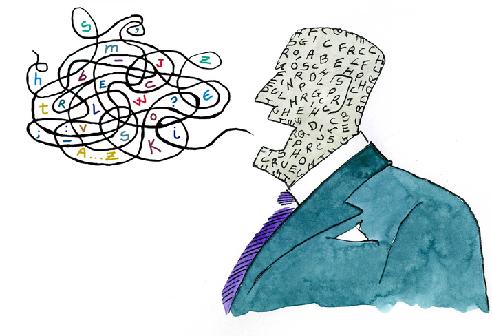
Master Font Psychology to Bring Personality and Purpose

If you wanted to make a splash at a spring gala, what color would you wear?
If you wanted to be known for your edgy personality, what kind of car would you drive?
Just as your personal appearance creates emotion or impact, your design choices will too. While we often undervalue text in designs, every font has a unique personality and purpose. A little font change can go a long way.
With that in mind, take a look at font psychology and see how using it well can win customers through print!
How Fonts Influence Emotion
What is font psychology?
Font psychology deals with the impact fonts have on the thoughts, emotions, and behaviors of readers. For example, when you use a Bookman Old Style headline, it’s going to carry a very different tone than a Brush Script or a fanciful Curlz font. When you feature Tempus Sans in primary body copy, it will bring a more contemporary vibe than Franklin Gothic. Once you understand the associations a font carries, you’re on your way to using fonts to create the emotional impact you desire.
Fonts contain features like line, weight, size, and orientation. When you see a font, your brain disentangles those components and associates them with characteristics from the real world. For example, italicized fonts mimic movement (like a runner leaping off the starting blocks), and flowing scripts convey creativity (like a dancer spinning across the stage). Fonts mimic visual characteristics from the real world, so if you want to choose an appropriate font, choose one that visually resembles your context.
Keep it Simple with This Font Cheat Sheet
When you think of the vibe you want to convey, what adjectives come to mind? Basic or bold? Gentle or hardcore? Elegant or gritty? Once you’ve identified the tone you want, here is a cheat sheet you can use to craft corresponding messages:
Slab Serif fonts (or “Egyptians”) are perceived as important, bold, impactful, or attention-grabbing. Great slab serifs include Sentinel, Adelle, Clarendon, Linoletter, Archer, and Amasis.
San Serif fonts are perceived as simple, sensible, straightforward, neutral, and easy to read. Popular selections include Apercu, Futura, Avenir, Verdana, and Avant Garde.
Simple Serif fonts are seen as stable, respectable, timeless, formal, or traditional. Classic serif fonts include Garamond, Times New Roman, Georgia, and Palatino.
Bold or weighty fonts are seen as dominant, commanding, gallant, significant, and reputable. Have fun with bold fonts like Qanelas Soft Typeface, Nevis, Municipal, or Andor.
Condensed or ultrathin fonts carry a professional, forward-thinking, logical, or influential quality. To sharpen your image, try fonts like District thin, Antipasto pro thin, or Cocotte ultralight.
Vintage fonts come across as old school, retro, stylish, and remarkable. Type outside the box with six different Zing Rust fonts and carefree fonts like Palm Canyon Drive, Parker, or Lovelo.
Script fonts bring a sense of femininity, elegance, connection, and indulgence. Fun script fonts include Allura, Mistral, or the Segoe family.
Decorative fonts are seen as casual, cool, unique, or high-spirited. Stretch the limits with The Bomb, Circus, Cute Notes, Keep on Truckin’, and more!
Mono-spaced fonts can bring a techy, sophisticated, or smart vibe. To sell your credentials, try Courier, Inconsolata, Maison Mono, or BP Mono.
Display fonts bring a chivalrous, quirky, friendly, or eccentric tone. Use fonts like Amadeus, Anudaw, Bearpaw, and Collegiate to make design twice as fun!
Keep Fonts Front and Center
While fonts are sometimes an after-thought, text is an integral part of your branding and emotional impact. And many online resources are available to help you find fun, free fonts.
Use your font choices to shape perceptions, streamline messages, and project your intent.
- Tags: fonts, marketing, printing, psychology

