Tips for creating and designing a great looking and functional brochure from Print It Plus
Choosing the best, most productive ways to market and brand your business has become an increasingly complicated task. Marketing budgets for most small companies are limited. And with the continued explosion of the internet and the lessening impact of some other, more traditional forms of marketing, many business people have started to believe that you can abandon the traditional forms, including brochures, all together.
This kind of thinking on the surface may seem sound. In reality, though, putting all of your marketing dollars into just the internet basket can prove to be a costly mistake. Even today in 2014, you need to have something of substance to hand to potential clients that will get you noticed and help to build your credibility in ways that the internet does not. A great looking and functional brochure can play an important role in your marketing strategy for engaging your clients and potential clients alike:
A well-constructed brochure:
- Gives pertinent information about your company to potential clients.
- Company information, including: website, phone number, tagline, mission statement
Gives reasons that you are different and better than your competition
Gives information about other products and/or services that you offer that a potential or current client might not be aware of
- Menu of services
Great way to showcase successful projects that you have already completed
Grabs your attention with vibrant eye catching graphics
More likely to get your client or potential client’s attention, which is half the battle in trying to get your marketing message across
The consumer wants to know what you can do for them… a good brochure conveys that message strongly and succinctly
The most important thing to include is what you can do to help them by using your company. Include information that customers frequently ask you about your company.
Use Images that show customers what you can do for them.
Design Tips:
- Select an interesting background or use an image that applies to your business. The colors should go along with your branding and allow customers to relate to the information.
- Use bulleted items to highlight products or services.
- Box off areas to break up text into relevant sections.
- Use lots of photographs. The saying that a picture is worth a thousand words is really true. Not only does it make the brochure more appealing, it will keep your audience’s attention longer and allow you to get more of your message across.
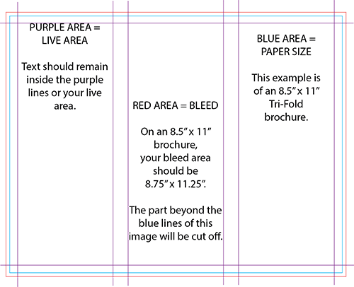
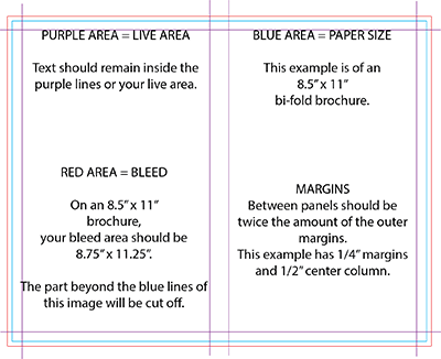
If you are going to fold your brochure, you should consider that in the layout. Your “live area” margins should be at least ¼” on all edges and the space between each of the panels should be double the amount of your margin. You should never have wording any closer than the ¼”(live area).
IE: if you use a ¼” margin on the edge of the page, you should allow ½” between panels, if you use a 3/8” margin, you should allow ¾” between panels, etc. See diagram below.


If you are going to bleed images like a background or color, you should make it at least 1/8” larger (on all 4 sides) than the sheet of paper. Cutting cannot be done on an exact line when we are cutting a stack of paper in a guillotine cutter. Giving us at Print It Plus the extra will insure your image will look great in the background.
Whether you need a Brochure, printing, digital printing, full color printing, business stationery and forms, memos, menus, logo design, promotional products, marketing and advertising design, mailing services (direct mail), website design and marketing solutions, Print It Plus is the place for you to bring your business in West Palm Beach, Royal Palm Beach, Palm Beach, Loxahatchee, Lake Worth and throughout Palm Beach County.
